Alice in horror land is my own version of Alice in wonderland same story line but with a twist of intense-drama, murder, and vengeance the first Alice well down the rabbit whole she woke up in an upside down world of torture pain and horrifying things happening in front of her the queen get the word that there's a stranger in her land trespassing as she puts it, Alice is wondering around with a knife her hand to avenge her family who was burnt to death in a fire Alice couldn't save them only herself in which case she ends up in the mental hospital because of disturbing screams from her family stick in her mind until she gets her vengeance on the person who done this to her (the queen of hearts) The Cheshire sees her in reality world and wants to get her revenge for her family (she defeats the three characters that try to kill her one shot they're dead by Alice, after them it’s a quick walk from one end of the hall to the other by the big double doors the Cheshire cat explains how to defeat the queen but gets blown up by the queen of hearts then Alice enters the room walks three steps then there’s a little bit of talking then between both of them then the dramatic frightening battle between both world the parallel world and reality this all takes place in 1900th. Then Alice will get her vengeance by saving her mother’s and father’s soul then she wakes up back to a normal 12 year old life. THE END
Wednesday, 20 October 2010
shopfront halo reach


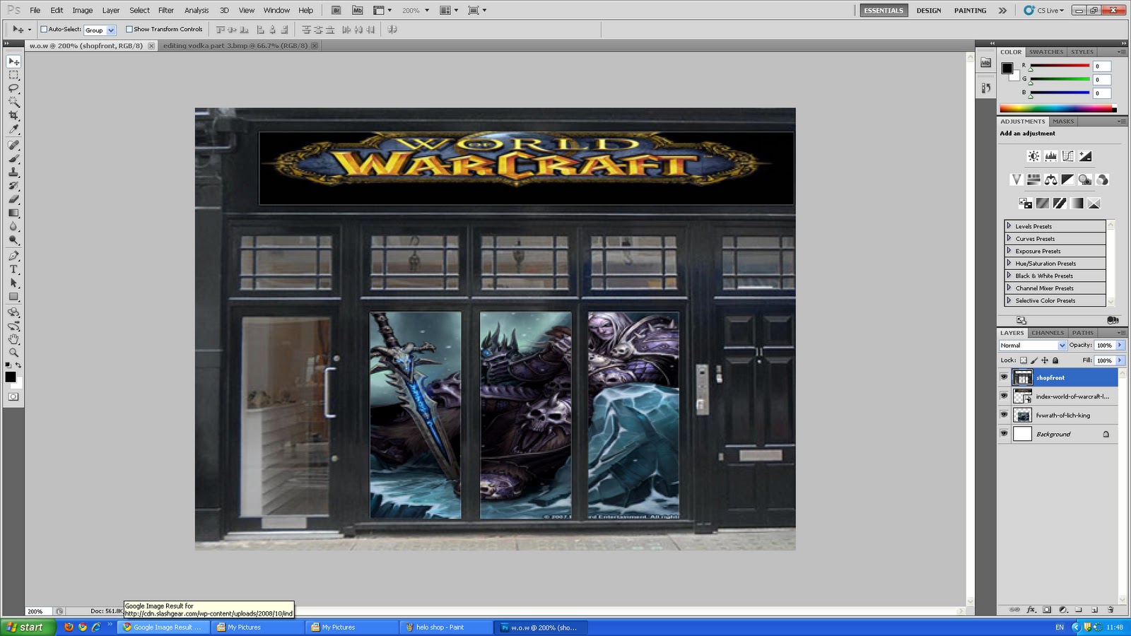 Putting pictures in to the shop by blanking out the shop adding the images in used the magic tool to get rid of the white spaces in the shop windows and head board, then opened up then my images were in the blank spaces of the shop
 two other methods of capture
Method one- Sound Recording- Recording voices and sounds wildlife
make sure you have permission to capture of people before you start
Method two- video camera- recording sites people
make sure you have permission to capture of people before you start
Method two- video camera- recording sites people
Tuesday, 19 October 2010
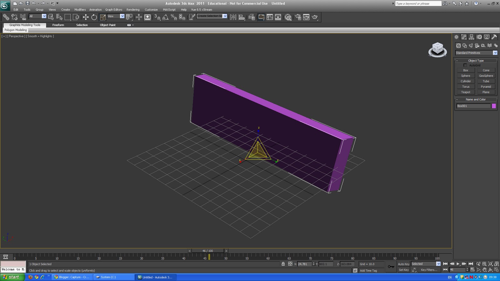
Vodka texture on 3D max


We have experimented with a word, I chosen vodka because it was catchy to see like that and different use text tool typed in one letter V, Then copy and paste it right click move then moved it went back to text tool change the second v to an O and the same again for D, K, and A,
I then messed around with the spotlight to see how it would look at different angles but I found the correct one by rotating the word so I could see it from bird eye view then checked it out then it would be better for the shadow behind the word, and created a master piece with the word vodka.
I'm really impressed how it came with out with images of vodka labels i took off of Google to put on to the letters,
My best piece of work so far =]
3D max

We had an introduction to 3d max with basic rotations and scale and move the object around
 Use of typography in 3d max using the text box then messed around with the settings adding shadow subtracting shadow expanding the length and size of the text changing the colour of the text
  Used the box then vertex, polygon used extrude to create longer blocks or in wards blocks get dots to form a box when girded select them then use vertisments
  Changed the colour of the box to purple then went to modify to change the settings to turbo smooth pressed 7 to see how many polygons i had used for this piece of work 8,192
vents 4.098 every time i go past a surten number the six its crashes the programme so then i have reload up the programme (Iteration numbers needs to be below six)


Monday, 18 October 2010
T-shirts Designs
 - Graffiti my name and year born
  -Ashtor Park poster
  -my Identity
 -typography
Tools used: smudge tool, curves for the t shirts, paint brush tool size 34pts done my name and year i was born to use as my graffiti
for my Identity i was going to use my shoe but because i had forgotten to use the pen the every other task after it i couldn't use it, So I gave up on it
Wednesday, 13 October 2010
Personal ID
Using black and white Typography using a part of my personal ID of my self to show who i am and my personal interest are, We are using our name and D.O.B in our A3 poster of our ID we shall be using camera and illustration and scanning images and styles and types of text
i will exploring different things for this piece of work Type, Image, Layout, Size, Texture, Types Manipulation, Photgraphy in this piece of work to explore different options to create the perfect piece.


 The A3 has to be 420cm by 29.7 150 res
 i have used some of the tools i have previously used in the past to create my date of birth and my name i messed about with paint brush and the settings and smudge tool to create my name and edit up my D.O.B edited my smaller name and D.O.B for a bigger and more excitting texts and its the similar style of text to the high top (trainer)
i will exploring different things for this piece of work Type, Image, Layout, Size, Texture, Types Manipulation, Photgraphy in this piece of work to explore different options to create the perfect piece.


Tuesday, 12 October 2010
Graffiti artist Roy Christie
This afternoon i was listening and taking an interest in to Roy the graffiti artist, He made me experiment with types of style and techniques of using and pencil and a pen but i imagen my holding a spray can and a wall, so i can put myself into Roy's persition as he is the graffiti artist before we started the experiments, He told us about how graffiti started in the 60's the by the 80's how about people were treated differently from being ingored by talking but when they grabbed a can it was different they were heard, Some older generations may well think it looks horrible but our cities look dull without any colour on the walls graffiti is just art but its can also be illegal if you don't get the permission from the city council. He was really down to earth Roy was he told us how he started off just painting with paint brush when he was eight years old, then he told us how he met some one graffitti artist, What he has done for communities how he helped out Devonport high school, His inspirations the positives and negative of them and explained why he liked/disliked them. In all a very good workshop i want more of them.
big thanks to Mars and Lee =]
big thanks to Mars and Lee =]
Research On Graffitti
References-http://library.thinkquest.org/04oct/01253/history.html
History- Graffiti has been around for millions of years. Romans wrote on the walls of buildings they conquered and cave men drew illustrations on cave walls, although graffiti has not been in the United States quite that long. Graffiti first became big in New York and spread through other states. It started as tagging or writing your name on a street sign. Then gangs used graffiti as a way to mark territory. Not long after, graffiti became a form of art. It inspired young artists to come out and use this new art as a form of self expression. Whatever mood they were feeling they were able to make somthing beautiful. Lee Quinones, one of many graffiti artists, changed the grimy place near Brooklyn bridge into an incredible gallery of art.


History- Graffiti has been around for millions of years. Romans wrote on the walls of buildings they conquered and cave men drew illustrations on cave walls, although graffiti has not been in the United States quite that long. Graffiti first became big in New York and spread through other states. It started as tagging or writing your name on a street sign. Then gangs used graffiti as a way to mark territory. Not long after, graffiti became a form of art. It inspired young artists to come out and use this new art as a form of self expression. Whatever mood they were feeling they were able to make somthing beautiful. Lee Quinones, one of many graffiti artists, changed the grimy place near Brooklyn bridge into an incredible gallery of art.
Graffiti started moving from streets to subways and quickly became competitive. Graffiti artists had to compete for space and it inevitably offended property owners. This, and the misunderstanding that all graffiti represented gang activity, led to community pressure on polititions. But still graffiti artists strive to improve their art which is constantly changing.
Purpose- Graffiti. This is something most of us see everyday. It is all over walls and buildings downtown. My school is in the center of "Graffiti Heaven". But have you ever thought about graffiti? When you do think of graffiti, does your mind go to vandalism... or art? Yes, there is plenty of graffiti that is rude and disrespectful. But it can be used for good. For art. Art is a good way to express your true feelings. It is the same with graffiti. Some of us might not view graffiti as art, but, believe it or not, it is.
Graffiti is a form of self-expression and creativity. Some graffiti artists might be angry at something or someone. They take it out on the walls. Some people paint graffiti just to be vandalizing. Gangs paint graffiti to mark their territory. But some people create graffiti with a hidden message. Some people make graffiti with a purpose- to let out their feelings and to add a bit of color in everyone's lives. I know whenever I walk downtown, I see mostly colorful graffiti. Graffiti that is not disresepctful.
Some people are actually paid to paint graffiti. For example, the TATS CRU in New York is known as the Mural Kings for painting graffiti in subways and streets. The TATS CRU is sometimes paid to advertise on the street walls with their graffiti. The TATS CRU is another example of ways graffiti can be used.


Styles and Types Of Stencils-from Banksy images I have gotten of the internet, They inspired me to use in my blog for my stencils.
Monday, 11 October 2010


Editing me


Took a photo of me, then placed it in to photo shop edited my photo to black and grey by going to filter then hue and saturation then used the magic ward to pick a spot on my face then using a new layer to use the Type tool clicking on my face then typing in the area selected, Then use lead and spacing to create bigger and smaller sentsenses
Wednesday, 6 October 2010
Typography
Different style of types of Typography


 typography is everywhere nowadays Carson still manages to communicate both the idea and the feeling behind his design. His extensive use of combinations of typographic elements and photography led many designers to completely change their work methods and graphic designers from all around the world base their style on the new “standards” that have distinguished Carson’s work. Carson is most famous for his ability to create spreads that even with little content seem to be substantive. Carson’s work is familiar among the generation that grew up with Ray gun Magazine and its progeny such as huh and xceler8, and in general, the visually savvy MTV generation, but his work still receives criticism from a generation that refuses to engage with his connotative excesses.
 David Carson Research

David Carson is self indulgence typographer he was into the beech culture and worked for a surfer magazine, then worked for a stake boarding magazine. Carson still manages to communicate both the idea and the feeling behind his design. His extensive use of combinations of typographic elements and photography led many designers to completely change their work methods and graphic designers from all around the world base their style on the new “standards” that have distinguished Carson’s work. Carson is most famous for his ability to create spreads that even with little content seem to be substantive. Carson’s work is familiar among the generation that grew up with Ray gun Magazine and its progeny such as huh and xceler8, and in general, the visually savvy MTV generation, but his work still receives criticism from a generation that refuses to engage with his connotative excesses.
Tuesday, 5 October 2010
My investigation on the Camera and two other methods of capture


The first cameras were enormous. Athanasius Kircher (1601-1680) in a book written in 1646, described one which consisted of an outer shell with lenses in the centre of each wall, and an inner shell containing transparent paper for drawing; the artist needed to enter by a trapdoor.
· 1814
Joseph Niepce achieves first photographic image with camera obscura - however, the image required eight hours of light exposure and later faded.
Joseph Niepce achieves first photographic image with camera obscura - however, the image required eight hours of light exposure and later faded.
Capture

-Organise your final method -camera
- Investigate one capture method ( Only a Brief)
Subscribe to:
Posts (Atom)